
Used to be that what’s on the inside is what counted, but in a rapidly changing craft-beer landscape overflowing with a variety of hoppy concoctions, it now seems that what’s on the outside is what matters most. Store shelves are no longer a place to merely display product; they’ve become de-facto art installations, and the products are no longer merely alcoholic beverages; they’ve become works of art. For modern-day microbrew artists, the canvas of choice: a can.
Mashing in Marin
 In 1989, Brendan Moylan had to decide between the designs of two artists for the labels that would adorn the first flagship brews of Marin Brewing Company. A design from Cynthia Gibson, a Santa Rosa–based artist, won out. Thirty years later, Gibson still works with Moylan to design the labels for his cans from Marin Brewing and Moylan’s Brewery & Restaurant, the latter being the first brewery to open in Novato in 1995.
Moylan’s is equal parts craft brewery and Irish pub, something reflected in the logo since the beginning. “The Irish ‘M’ is kinda boring,” Moylan says. “We made the Moylan’s ‘M’ with more of Germanic font and added the braids in the background to give it the Celtic feel and weave in my Irish-American heritage.”
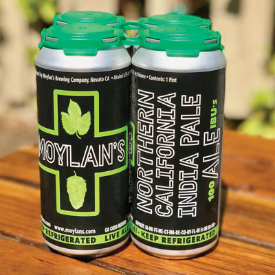
Moylan’s logo hasn’t changed much since 1995, but a recent trip to Portland inspired Moylan to tinker with the brewery’s design. The number of medical-marijuana dispensaries on every street corner in the Rose City made an impression on Moylan, who decided to incorporate the green medical-marijuana cross as an alternate logo. The cross is featured on the NorCal IPA and the ManGo Crazy session IPA. The recent demand for craft beer in a can has prompted Moylan to adjust his business model to the consumer base. Although Moylan’s has been canning its beer for five years, last year was the first time the company canned more than it bottled. “The 22-ounce bomber bottles aren’t selling like they used to. Everyone wants to drink their beer out of 16-ounce cans,” he says.
Adjusting to the shift in consumers’ tastes has been made easier by a local, mobile canning company helping independent breweries fulfill can orders.
“The companies like Ball and Crown are no help to craft brewers with their high-volume, minimum-order requirements,” Moylan says. “Breweries like HenHouse that self-distribute are now proving to be the best model.”
Chicken Nuggets
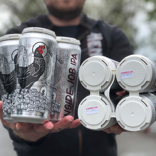 The artist handling the graphic design work for HenHouse Brewing Company is the “one-man art department” of Josh Staples, who worked with the owners at a warehouse facility prior to the brewery’s taproom opening in 2016. Unlike other local breweries, HenHouse has a particularly noticeable mascot taking center stage on its cans: the hen. “Animal logos are iconic,” says Staples, “and people can relate to that and the love of nature.”
HenHouse’s founding members hold a strong connection to chickens, hailing from Petaluma. Staples grew up on a farm and chose a “Petaluma-style hen” as inspiration for the HenHouse mascot. “I had a few renditions of the hen, and it went from being ornate to a little more realistic,” he says. “I tried using a wood-cut print at first, then combined hand-drawn elements. You can’t have a brand called HenHouse and not have a hen. We want people to know it’s a HenHouse beer when they see it.”
HenHouse’s recognizable lineup of beers catapulted the brewery into something of a ruler of the roost for the North Bay craft-beer scene. The brewery developed a hardcore following of hop-heads, eagerly anticipating releases of their “conspiracy theory” line of India pale ales, like the Chemtrails IPA, throughout the year.
As the brewery’s tap list has expanded, so have the designs. The hen has found herself standing atop a mound of cash outside a bank vault for the Inside Job IPA, directing airplanes as an air traffic controller on the Denver Airport IPA, and going where no chicken has gone before, standing on the lunar surface in the Hollow Moon IPA.
“As a kid who grew up interested in conspiracies, it’s fun to play with them in my art now,” Staples says. “But it’s also tricky because you want to make it light and relatable, and when putting the hen in there, I try to make her safe.
“In the beginning,” he adds, “she was stoic and always on her own, but when we started putting her in outer space and driving tractors, I wanted to make sure she still looked dignified.”
Staples’ favorite design outside of the conspiracy theory line is a brut IPA called Joy Delivery System. The design is a fantasia of frightful fun, featuring a hop-juggling, unicycle-riding beer can, a giant clown face, hot-air balloons and, of course, rainbows. The Joy Delivery System artwork serves as a delightful tapestry of amusement, conveying the euphoric sensation one might feel after imbibing the brut IPA.
“It’s really colorful and wacky, and reminded me of an ’80s cartoon puzzle. We actually ended up releasing a jigsaw puzzle based off that label,” he says.
Although Staples and HenHouse continue to push the look of their cans to new frontiers, Staples prefers to rely upon an old-school aesthetic.
“The creativity and the hand-drawn elements are most important to me,” he says. “I still draw on paper. We have several binders full of hand-drawn designs at the brewery.”
Simplicity Sells
Despite the staggering number of craft breweries reappropriating, reimagining and remixing the way beer is brewed and viewed, there remains a small contingent of microbreweries opting for a “less is more,” scaled-down approach.
Santa Rosa’s Moonlight Brewing is renowned for crafting classic beer styles for over 20 years, and Fogbelt Brewing Company has developed a unique, albeit understated, look behind its brand of brews since opening in 2013. Fogbelt’s theme of a tree-lined setting under a dense layer of fog is the staple imagery for many of its flagship beers, the majority of which happen to be named after coastal redwood trees found only in the fog belt. The brewery rarely strays away from this region-centric marketing, a concept that took root from the beginning, says Fogbelt’s principal graphic designer Paul Hawley.
“The theme comes from our personal affinity with the area,” he says. “Besides, what’s better than hiking in the redwoods and enjoying a nice IPA afterward?”
Hawley comes from a wine background, designing labels and serving as general manager for his family’s winery, Hawley Winery in Healdsburg.
“I wanted a label that looked somewhat high-end and got away from the loud and cartoony stuff,” he says. “At Fogbelt, we want the label to show that we take the beer seriously and that we aren’t going to make fun of what’s inside.” What’s inside is a refreshing elixir as crisp and cool as any coastal morning fog.
For Hawley, the challenge is developing fresh ideas for the label art but keeping it consistent with the brand. “If we suddenly released a label that had android-armadillos, people might be like, ‘What the hell is going on at Fogbelt?’” he says.
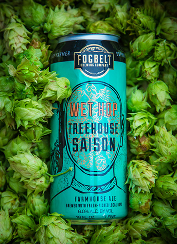 Android-armadillos notwithstanding, Fogbelt has branched out on occasion with imagery outside of the forest. Fogbelt’s Wet Hop series of cans featuring a head full of hops is a label Hawley designed based on a Soviet, anti-alcohol propaganda poster. Hawley removed the original illustration’s inclusion of hawks inside an empty mind in favor of hops.
“I think reappropriating images is more out of necessity. We don’t have a huge staff of graphic designers. We have to work with what we’ve got,” he says. However, Hawley doesn’t consider himself a graphic designer, “just a guy who taught himself Adobe and likes to tinker around.” Hawleys says that Fogbelt plans on expanding its portfolio of label art by recruiting local artists to design original labels in the future.
An original design of note for Fogbelt from a packaging standpoint is its recently released Godwood Triple IPA. The label of the 12-ounce can displays a giant redwood ascending up the side, and when one Godwood can is stacked atop another, it displays the full-sized image of the tree. “I was just playing around with the format and seeing how I could turn it into more of a canvas,” Hawley says. “We’ve seen the one-upmanship of hopping rates, ABV, and other ingredients, and now what’s left is the packaging—it’s almost an arms race to outdo one another with the hippest and coolest label art.”